Last month, we introduced you to the basics of the Esri ArcGIS Operations Dashboard. In this installment, we will explore more widgets, and help you get the most out of this tool.
Reconnecting
To get started, we will log back into the Operations Dashboard and pull up our previous Operation View.

Adding Widgets
After our view is loaded, we will add another widget to it. On the top menu bar, click Widgets/Add Widget. Scroll down and select Legend and click OK.
Set the Title to your preference and click OK.
You will see the dockable window floating over top of of your view. Go ahead and drag it to the right where Meter Details widget is and move it to the top. Presto! You have just added a new legend widget to the view.
Configuring Widgets
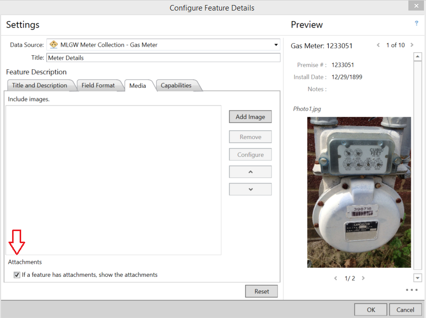
After a widget is created for your view, you can edit its configuration by clicking on the widget’s gear icon and then click the Configure option. Since the Feature Details widget in our view is a bit large due to the attached image, we will remove the image from the widget to save space.
Under the Media tab, uncheck the show attachments option and then click OK.
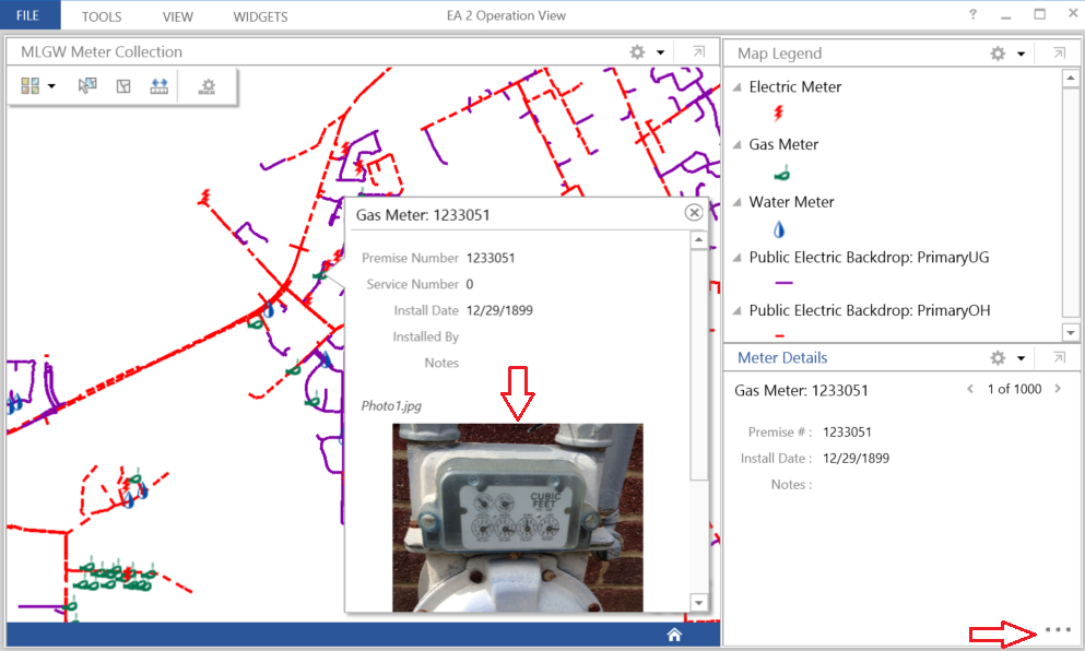
You’ll see that the attached photo is removed from the widget, which cleans up the display a bit. Now, to get back to the attachment, click the elipses on the bottom right of the widget and choose Show pop-up. The details will then pop-up for the selected feature on the map widget.
Working with Data
Now that you’ve seen how easy it is to add and configure a widget, let’s dive into the data some more. One very useful widget for the operations view is the Query widget. Go ahead and add a query widget.
Start by adding a useful Title and Description. Next click the Add button to add a query to the widget.
For this example, we will want to query the meter inspections that happened in August 2014. Select the Install Date field with an operator of Is on or after and then enter the value of 8/1/2014. Then click the Add button.
Repeat the step this time using the opertor of Is on or before and the date of 8/31/2014. After clicking Add you will see the criteria with a default connector of And. The definition looks like this:
If you have been following our ArcGIS Online posts, and the Query Definition screen looks familiar to you, it is. In About…ArcGIS Online – Searching Your Data, you’ll see a similar screen there. Esri has been pretty consistant on the user experience when working with ArcGIS Online tools, and we like that!
Now give the query a new name, like August 2014 Meter Installs and press OK. You will see that the new query definition now shows up in the list of queries for the widget.
For now, just press OK on the widget and we will dock it below the map. Don’t worry about all the white space, you’ll see that we will need the area for the query results.
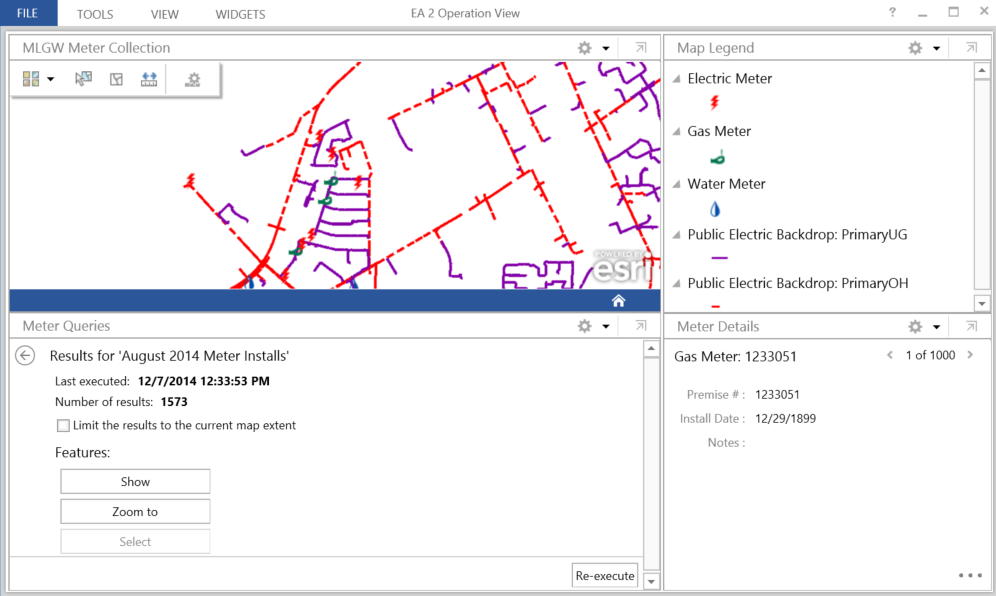
Now you can run the query by selecting the Execute button on the far right of the query. After the query runs, you will see the results in the widget.
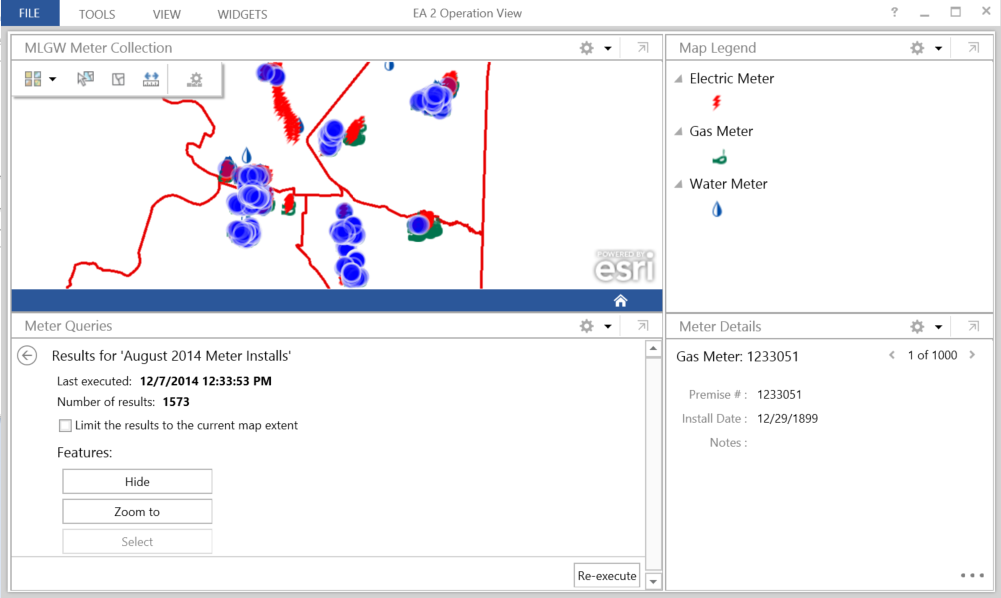
Clicking the Show button will highlight the meters in the resultant set, however, due to the current extent of the map, we don’t see anything. So press the Zoom to button to change the extent, then click on the Show button again to see the results.
Notice the checkbox called Limit the results to the current map extent ? Let’s explore that option.
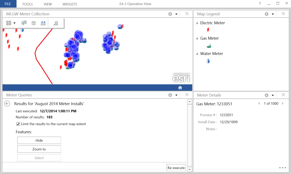
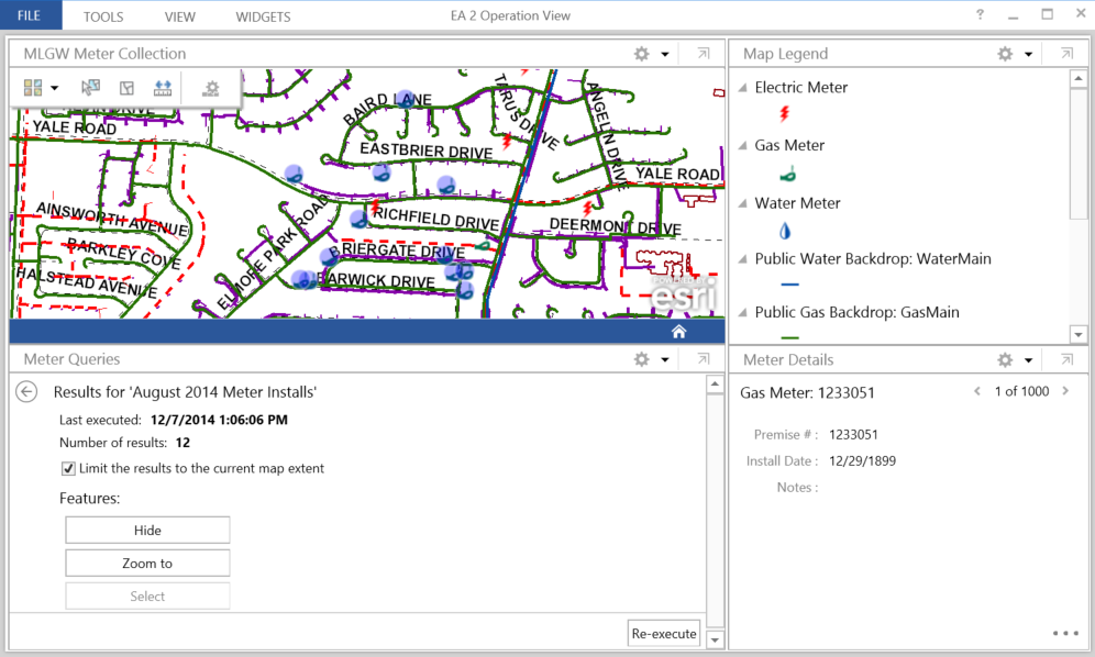
First we will zoom into an area where we know there are meters that meet our cirteria. Then, we will check the Limit… option and the query will re-execute without pressing the Re-execute button. Notice that the result set is now 183, down from 1573 previously.
Changing the extent, however, will not refresh the results count. If you want the count to refresh, you will have to press the Re-execute button after zooming in. Now we have a closer look at the results and the data reflects what we see on the map.
Additional Visual Value
If management sets a goal of 2,000 meter inspections for the month of August, with a minimum target of 75%, we can easily use the Gauge widget to have a nice visual cue to the progress being made. Let’s take a quick look at how to achieve this.
First, add the Guage widget and change the Title to “August Goal”. Next, change the Data Source to be from the query results. Now, for the Display Type option, choose Count.
Finally, configure the Target Range options. Set the Maximum Value to be 2000 (the number set by management), and then check the Include threshold value checkbox. Set the value to 75 and check the Percentage checkbox (the minimum target goal).
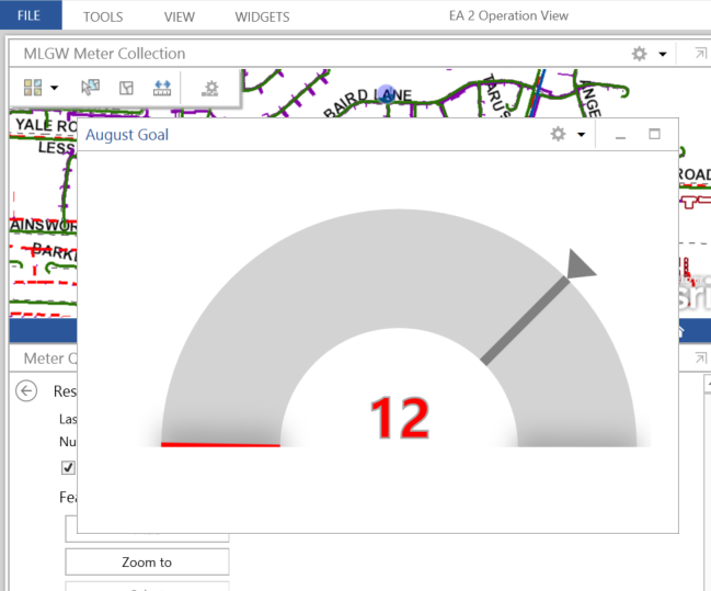
Finally, on the Appearance tab, change the Below or equal to Threshold Color option to red using the color picker. Click OK. Here is your result:
Remember, that we are using the results from the query. At this time, the results are still from when we zoomed into that small service area from the example above.
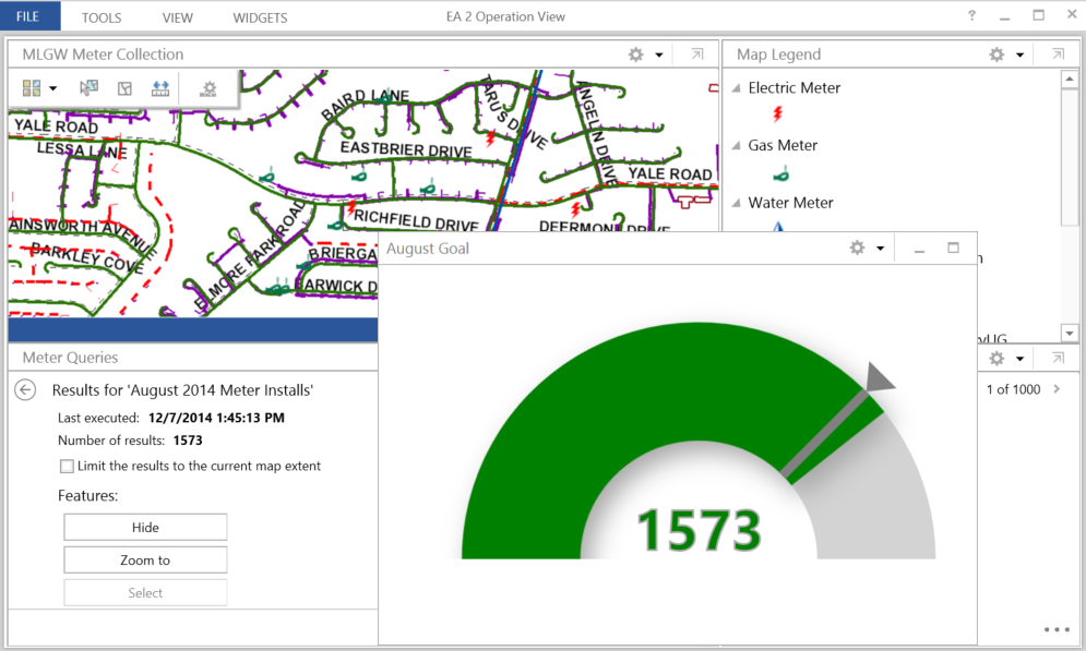
Move the floating widget out of the way (we won’t dock it this time) and uncheck the Limit the results to the current map extent option. The query will re-execute, and the gauge will automatically refresh.
Pretty cool stuff, and we have reached our minimum goal of meter replacements for the month of August. Nice work field crews!
Wrap-up
In this follow-up article, we have seen how to take our example operations view a few steps further. You have seen how to add more widgets to the view, and start looking into the data by using queries. Finally, we saw how we could visualize the data using the Gauge widget.
There is more to explore with the Operations Dashboard; we just wanted to get your creative juices flowing with this example. At this point, make sure you hit File/Save, so you don’t lose all your hard work. And be sure to let management know that August was a decent month for meter inspections. Enjoy!


What do you think?