The Esri ArcGIS Operations Dashboard is a nifty way to bring all your common tasks right to your desktop. You can monitor real-time data, integrate maps, collaborate on different views of your data, and customize, on-the-fly, your view of your data. In Part 1 of a two-part series, we will demonstrate how to get up and running with the dashboard application and perform some basic tasks. Part 2 will drill down into more widgets and analyzing your data.
Getting Started
To get started, download and install the Dashboard from Esri at http://doc.arcgis.com/en/operations-dashboard/ by clicking on the button. Once installed, the first thing you want to do is sign into your ArcGIS Online account.
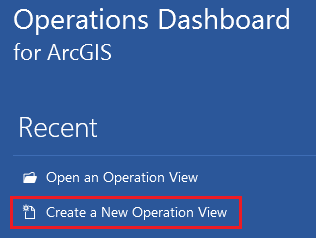
Then, click on “Create a New Operation View” from the left menu:
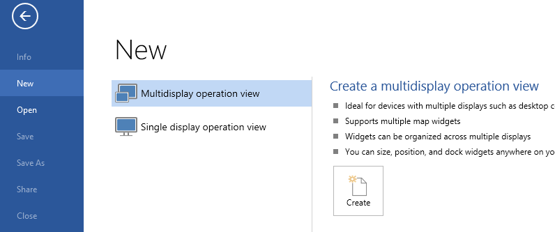
You will have two choices, one for multidisplay and one for single display. The difference is that mutidisplay will support multiple widgets and you can dock widgets anywhere you want. Single display will support only one map widget and is required to be used in a browser environment (iOS phone/tablet, e.g.). We will choose multidisplay since we are working with the desktop version. Now click “Create“.
For this demonstration, we will start with a Map widget. Choose Map and click “OK”.
Next we will choose our Map source. For this example we will choose an existing map from our online gallery, and click “OK“. This happens to be a map that we used for meter collection. If you want to learn more about that, see our MLGW Implements Meter Collection with ArcGIS Online case study.
Now choose your data source, and click “OK“. For this demonstration, we will use our gas data.
Your initial map widget will now be displayed.
That was pretty easy, and also very basic. The power of the dashboard comes with being able to add more widgets and tools, in order to manage your data in a variety of ways.
Adding Map Tools
To add some quick out-of-the-box tools, just click the gear button and you will be presented with some basic tools.
We will add some of our favorites – Basemaps, Select Features, Measure, and Clear Feature Selection. Then, using the arrows, we will move the Clear Feature Selection up in the list, next to the Select Features. Then click “Close“. Here is our newly configured toolbar:
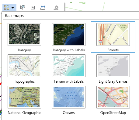
Let’s take a quick look at the Basemaps. This is something you should already be familiar with, if you have been exploring the ArcGIS Online world.
Add Widgets
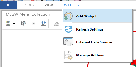
By using the multidisplay option, we have the ability to add multiple widgets. On the main menu, click Widgets / Add Widget.
For this example, we will choose to add Feature Details.
You will now have the opportunity to configure the feature details widget. First we will change the title to “Meter Details“. Then, we will turn off the OBJECTID, Service Number, and Installed By attributes.
On the Field Format tab, we can also change the display name of the attribute. Here we will shorten the word Number to # and add colons to the end.
For the Capabilities tab, choose a few from the list and click “OK”.
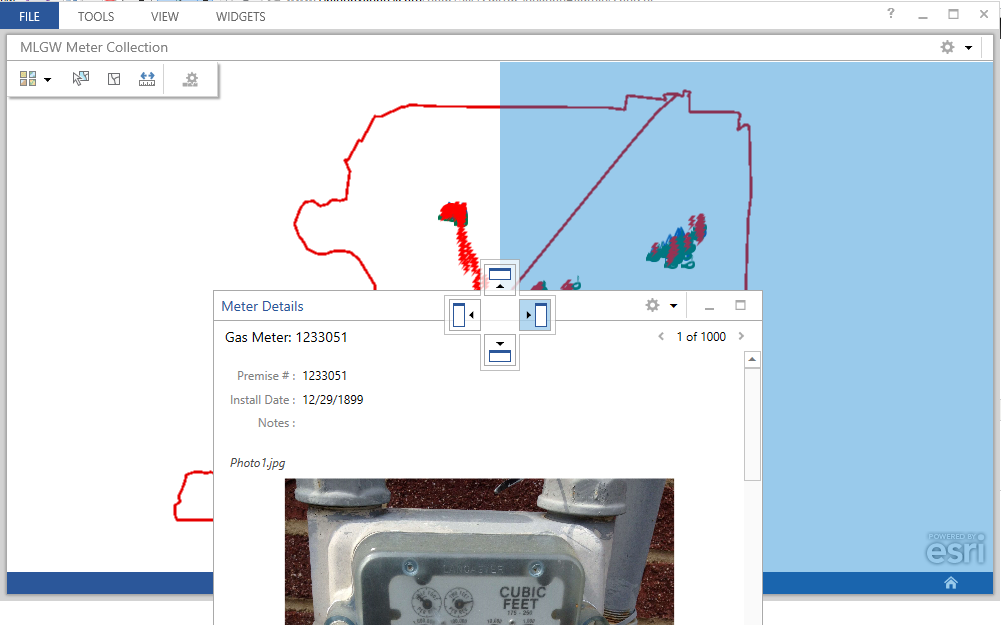
You now have a floating, dockable widget on the screen.
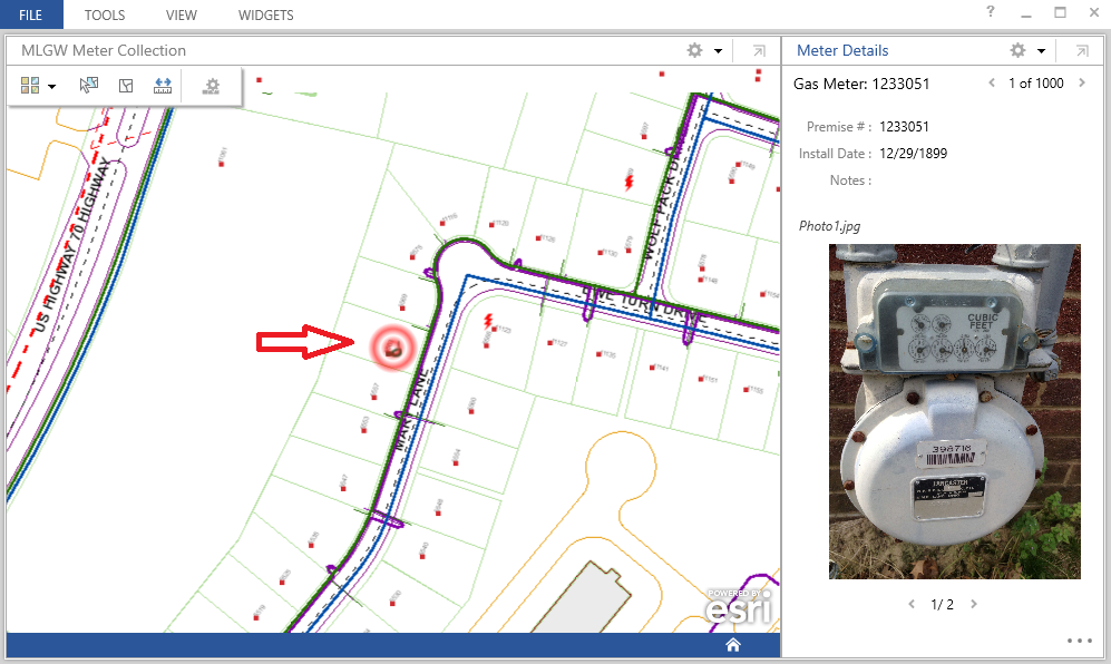
Grab the window and dock it to the right. You can also resize the widget by dragging the border.
Notice the elipses on the bottom right hand part of the Feature Details widget. If you click on it, you will get the menu of available capabilites. For this meter, we will click Zoom to and locate the meter on the map.
Now go back to the widget configuration and add the Highlight capability. That makes it a bit more useful!
Since we try to keep these articles informative and short, we are going to wrap up this up. We hope you have a general idea how the Esri ArcGIS Operations Dashboard works, and we will explore more in the next part of the series. There we will explore other widgets available in the application, as well as analyzing the data a bit more. As always, feel free to contact us for more information!




What do you think?