
Back in October, I started a new series called “About…” that would give our readers a quick look at new trending topics in GIS. This month, I want to revisit an article published by Skye Perry (Powerful Utility Reporting with ArcGIS Online) and demonstrate a new feature in the ArcGIS Online offering called Esri Maps for Office.
The Esri Maps for Office add-in allows you to create maps of your existing data right inside of Microsoft’s Excel. As long as your data has address or other location data, it’s just a few clicks to generate a map and then add it to a Power Point presentation or publish and share it in ArcGIS Online for others to use. Now here’s the small caveat – you will need an ArcGIS Online account to use this add-in. You probably already have one or have been thinking about one anyway, since you are reading this blog. If you would like to sign up for a trial account, click here.
Now let’s cut to the chase, and see this in action, by creating a dynamic map inside of Excel using the transformer data from the article mentioned above. If you need some guidance on getting started, jump to the installation section of this article.
- Once your raw data is loaded, click Insert Map, and then log into ArcGIS Online.
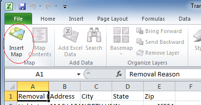

- Either Right-Click on the map and select Add Excel Data or click it on the ribbon.

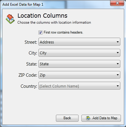
- Choose Cell Range and then select columns A through E. The range will auto-populate in the dialog box. Click OK.

- Choose your type of location data – we will choose Address and click Next, then verify our columns where the location data is defined and click Add Data to Map. You will then see on the right-hand side pane that the data is being processed.


- Now let’s quickly explore what’s available to visualize our transformer removal data, so we can present it to upper management.First, let’s bring up grouping (click Grouping in the ribbon or right-click your layer and choose it from the context menu) and select the “Removal Reason” column, change up the symbols, and zoom into our service area. If you don’t like the size of your symbols, go back to the Style Configuration panel and change the size with the slider at the bottom. You’ll now see that our embedded map looks a lot like the one that was created in the previous article using ArcGIS Online. For the finishing touch, click on the gear
 located in the map’s header and change the title to “Transformer Removals by Reason”.


You may also want to experiment with the other options available, such as Clustering and Add Heatmap. Since we have a large number of points on this map, we can cluster the data into groups, so we can visualize areas where transformer removals are high. All you need to do is click on Clustering in the ribbon and your map will change to the following:

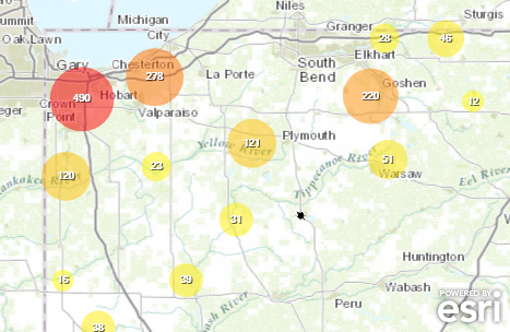
The clusters will automatically change as you zoom in and out on the map. This is pretty cool, as it allows you to present your data at a scale that you are interested in, and the clusters will adjust automatically. Here we will zoom in to a highly active area of our map – the cluster of 490 – so we can get a better feel where the transformer removal activity is taking place:

Clicking Add Heatmap on the ribbon will generate a new layer in your map showing the density of the points. Since it is a new layer, you can rename it, turn it on and off, and remove it without affecting your base map.
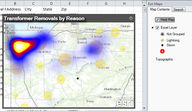 Again, the layer will update as you zoom in and out of the map. If we take a look at our zoomed-in area that we previously did in the clustering example, we can easily spot the most active locations and also see a “hot” area to the south.

You can also see here that I also turned off the data layer, because we are going to use this awesome looking graphic in our presentation.
Now that you have created your map, what’s next? Let’s take a look at the Share section on the ribbon.

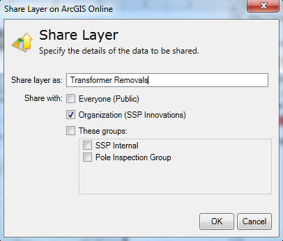
- Share Layer – send a layer to your ArcGIS Online account
When your layer is finished uploading to your ArcGIS Online account, you will see the ribbon change.

If you make further changes to the layer locally in Excel, you will then need to click the Update Shared Layer button.Now we’ll take a look at our ArcGIS Online account – and we will see that our layer was uploaded to the My Content section.

I can then click on the Transformer_Removals feature service and open it in the ArcGIS.com map viewer and further work with it, possibly creating a different map. But, as you may already have guessed, by sharing this layer with my organization, any one of us could re-use the data and create different maps from it. Pretty powerful stuff!

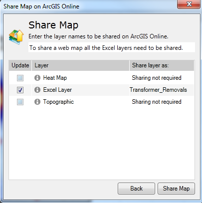
- Share Map – send the whole map to your ArcGIS Online accountFill in the required information and how you want to share the map, then press Next.

The next screen automatically selects the data layer for you as it is required. If you had any other layers in your map you could select them here. Press Share Map and wait until the process is complete. There is a publishing status indicator in the lower part of the Esri Maps panel.


Once it is complete, you can go back into your ArcGIS Online account and see the map in your content page.


I want to point out a very important note straight from Esri documentation on the inclusion of heat maps:Heat map layers cannot be shared to ArcGIS Online as a layer, but can be shared as part of a map. In the ArcGIS Online viewers (that is, the ArcGIS.com Map Viewer and ArcGIS Explorer Online), the heat map layer displays as a point layer instead of rendering as a heat map. When the web map is added to PowerPoint, the heat map layer displays as originally published from Excel.
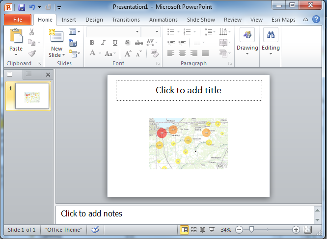
- Create Slide – opens PowerPoint with a new slide that contains your map.
- Copy Image – create a static copy (to the clipboard) of the map that you can paste into a document or email
Sharing options may not always be available. For example, if you have the heatmap layer selected, Share Layer will be inactive, since it cannot be shared on ArcGIS Online. Your account also needs to have publishing privileges assigned to it.
If you have interest in using Esri maps in presentations, you can also create interactive maps in PowerPoint. Without going into further details and making this article even longer, you can visit how to do that on the ArcGIS Resources site.
I hope you enjoyed this “About…” article outlining the latest technology from ArcGIS Online. The Office add-ins are a very powerful and useful set of tools to easily create dynamic maps and share them with your organization – all within an environment that you are already accustomed to. The use of Clustering and Heat Maps also allows you to add some additional visualization to your data and make your data more useful in presentations and/or reports. If you have any further questions, shoot me an email at [email protected] or feel free to provide some feedback using the “Add new comment” section below.
For more information about Esri Maps for Office, please visit the feature information page on the ArcGIS Online website. There you can download the add-in and watch some short tutorials on making maps inside of Excel.
Installation of the Esri Maps for Office add-in
- Download the add-in from the following location: Download Esri Maps for Office Page.

- Run the installer.


- Verify that Excel has a new tab called Esri Maps.

- If you also installed the add-in for PowerPoint, verify that that also has a new tab for Esri Maps.


What do you think?