Sometimes it’s a phrase you overhear whilst in conversation with someone else in the office or in the queue at a coffee shop. Other times, you are flicking through a magazine or a book, and your eye will stumble over an image or a word. You may have music on in the background to help with focus at work or when cleaning up the kitchen and a lyric drops neatly into your ear. Whatever the source, synapses fire in the medial prefrontal cortex, and a little voice goes “I want to know more about that”.
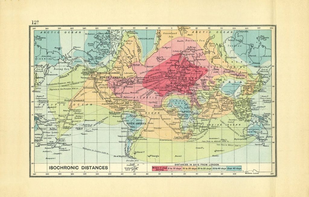
This one came from SSP President Aaron Patterson’s twitter (@aaronindenver – essential for all things Newcastle United Football Club and motorsports) one Saturday morning – this thing of beauty:

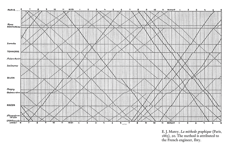
Even better than the simple visual purity of the information conveyed – travel distance in days from London in 1914 – is the name – “isochrone map”. I debated trying to work out the original roots using the remnants of my classical education, but the internet won out – “a line drawn on a map connecting points at which something occurs or arrives at the same time“, derived from the Greek (iso = same, chrono = time). The image is taken from rock star mapmaker John G Bartholomew’s 1914’s “An atlas of economic geography”, (complete catnip for cartographers) but I knew I’d seen this type of map before – some rummaging through the memories brought back Edward Tufte’s (the Galileo of graphics according to Bloomberg) seminal book on how to make large sets of data visually appealing (“5 stars, a real page-folder” – just about everyone). Specifically, EJ Marey’s graphical train schedule for Paris to Lyon in the 1880s:

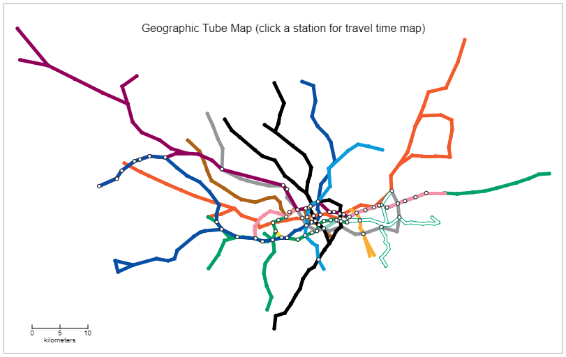
Properly interested now, some rifling through the back corners of the interweb uncovered the first reference to isochronic maps was an 1881 article in the Proceedings of the Royal Geographical Society and Monthly Record of Geography article “On the Construction of Isochronic Passage-Charts” by noted polymath, Francis Galton, possibly better known for inventing and naming the field of eugenics, coming up with the phrase “nature versus nurture’ and introducing questionnaires and surveys to collect the data he needed (amongst about fifty other things). From here, these maps underpinned the rapid expansion of transportation planning and hydrology/runoff analysis, with a sidebar into cardiology (measuring how long it took dilation of arteries to travel through the body). The time taken to generate isochrone (and isophane (measuring the cost to travel a given distance)) meant their growth was limited until the ready availability of cheap processing/computer power gave them a fillip. In 2005, Tom Carden rebuilt the iconic London Underground map using the time to drive the linear/distance scale:

Other projects such as Mapumental used a variety of source data (UK’s Ordnance Survey postcode data and public transport timetables) to calculate and display similar maps. This is carried on today by sites such as Mapnificent, which crunches public transport data for a list of cities (including Denver) to display some impressively Pollock-esque overlays of how far your bus can take you.
There is also a number of ways to generate isochrone maps yourself with publicly available sites/systems – Traveltime uses ESRI technology to show how far you can get from a given point on a variety of transport modes (depressingly (or inspirationally) it shows that I could get to the office in 30 minutes on a bike). A very solid roundup of some such services is here. In 2016, The Rome2Rio website took one of Bartholomew’s 1914 maps and ran it through their routing engine to produce a nifty little comparison, with some really interesting notes about reliability of the source data (Miami was 200km off) and how they had to overcome new boundaries and countries – well worth a read for a map that you might have seen in your news feeds around then.
Slotting neatly in with a real-world application, we’ve recently been given the heads up that it’s OK for employees to meet outside of the office, so I’m now trying to figure out where the best coffee shop is for our PMs to meet, given our starting locations, preferred modes of transport (bike, scooter, car, walking) and time they are prepared to spend traveling. Whatshalfway.com has an excellently simple interface to plot a central point from a number of starting points, coincidentally for our team, it’s also close to my house, so at least when everyone complains about it being really convenient for me, I can back it up with hard science and GIS.
Further reading on the subject for those so inclined – Atlas Obscura’s piece has some great follow-on links to more detailed dives into the approach to generate a map, with CityMetric’s round-up of maps for some major cities (some of which you have have been to).


What do you think?