Today, as our first Utility Network Jumpstart rollout inches ever closer, we’re continuing our tour of the Esri Utility Network. We do so by showing off the ability to create reports and view a load summary as well, for a circuit in the electric network. We will use Esri’s sample data from Naperville, IL.
We’ll run a Subnetwork trace to select all of the features in a given circuit. Then, we will create a chart to analyze the data for each feature to determine how many customers are fed by each phase. (Please note that the screenshots and associated video for this topic were created while using the new Utility Network Beta version 1. They utilize services to access the underlying features.)
First Step to Create Reports: Select All Features by Running a Full Circuit Trace in the Utility Network
We’ve already showed off the ability to run various electric traces in ArcGIS Pro. In this example, we’re going to utilize a Utility Network trace to select every feature that participates in a given subnetwork (aka our circuit).
We will locate the circuit breaker and use it as our trace starting point, using its load-side terminal.
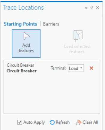
As mentioned in an earlier article, we’ll use one of our “wrapped” geoprocessing tasks to eliminate some clicks and pre-populate underlying values for the out-of-the-box Utility Network Subnetwork trace.
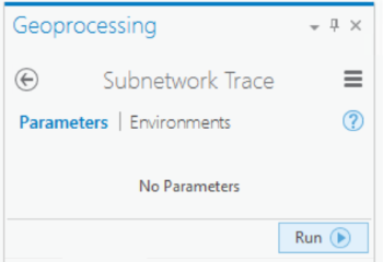 Running the trace has given us a very thorough selection of 8848 features that are a part of this circuit. If we look at the extent of the features (which Pro easily enables through a quick button) we will see that our selection matches the SubnetLine feature corresponding to our desired circuit. We now have more than enough data to run our report.
Creating a Chart in ArcGIS Pro
We’ve now leveraged the Utility Network to start to create a report, by selecting all of the features that are part of the subnetwork we want to use for our report. At this point, we can create a chart based on the data in our selected service points. This will help us see the load summary for our circuit.
Note that the creation of charts in ArcGIS Pro is certainly not limited to Utility Network data. We leveraged the Utility Network and its traces to select the data, and now we’re using built-in reporting functionality to generate our load summary report.
In our Contents pane, we can right-click on the “Service Point” layer and choose to create a bar chart.
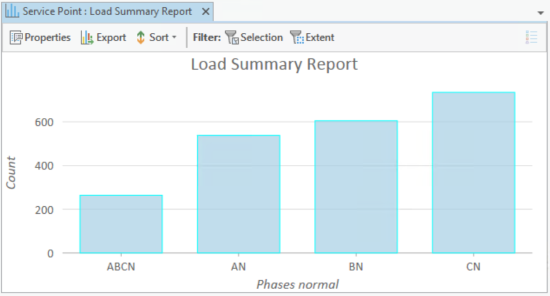
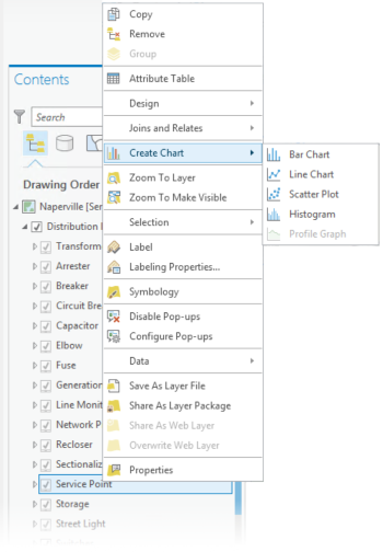 The “Chart” pane will open, and we’ll choose the options we want. We can use the “Phases Normal” field as our category, add it as a field in the “Fields” column, and indicate that we want to aggregate by count.
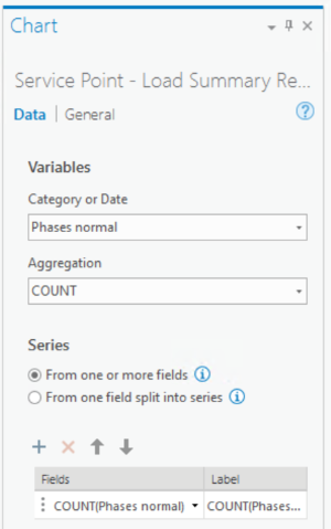 We can now generate, view, and export our chart as needed! We can very easily analyze the load on our circuit, and potentially take action if necessary. Here is the good-looking resultant chart:
Video: Watch How to Create Reports and Load Summary Reports in the Utility Network
Get Your Hands on the Utility Network
The fact that we’re on Beta 1 proves that SSP’s Utility Network Jumpstart program is about to be in full swing! This program allows you to jump right into exploring and learning the Utility Network without any internal setup. You will be able to gain proficiency with the Utility Network and get the opportunity to provide valuable feedback to Esri.
Want to help guide the direction of the Utility Network moving forward? Feel free to swing by our Utility Network Jumpstart page or give us a shout if you are interested!


What do you think?