Since the initial blog post on this ESRI solution, it has been renamed to ‘Gas Distribution Data Management’ which focuses more on the utility’s gas distribution assets. However, the solution remains largely the same overall. In this blog (part 2 of 3) post we’re going to explore the editing capabilities and workflows of the Gas Distribution Data Management solution. If you’re wondering “what the heck is Gas Distribution Data Management?” or need a refresher, refer to the first blog post HERE.
In this blog, we’ll explore three workflow scenarios that may be useful to both field and back-office users in the organization.
First, we’ll walk through adding some proposed installations via ArcGIS Pro, using the preconfigured Pro Project and feature templates that come ready made when you deploy the Gas Distribution Data Management solution.
Then we’ll look at adding some additional information to the proposed installations via map notes using the preconfigured Web Application editor.
Finally, we’ll take it to the field and use the ESRI Field Maps app to capture additional information for the installation.
ArcGIS Pro – Digitize Proposed New Service
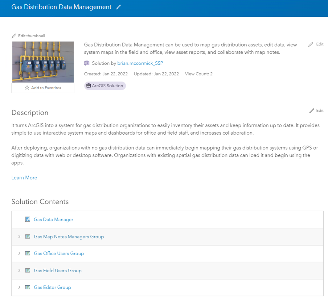
Let’s start in ArcGIS Pro with a sample work order/ proposed service installation. If you recall from the first blog post – the Gas Distribution Data Management Solution comes with pre-configured projects, maps, and apps and we’ll be using the ArcGIS Pro project provided within the solution to digitize the proposed service. In this example, I’ve stripped the project down to only contain the Gas Editor Web Map and relevant feature services. For reference – here is what the project looks like in ArcGIS Online and ArcGIS Pro:

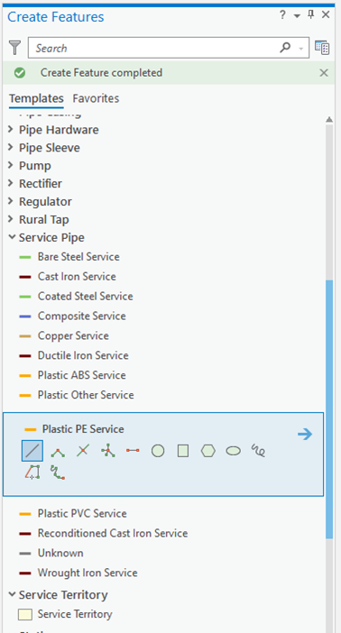
Next, let’s take a look at digitizing a new service line. Keeping with the out-of-the-box (OOTB) configuration of the overall solution, we’ll be adding the Plastic PE service line to the Service Pipe feature class. Notice the editing templates that are in place to make symbology consistent and seamless.
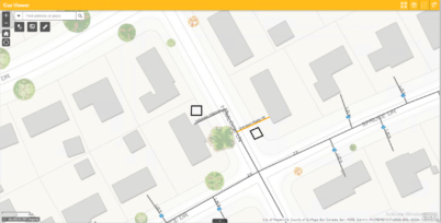
You can see that we’ve digitized a service line to a residence at the corner of Hemlock Ln and Spruce Dr. After digitizing the polyline we’re then able to fill in pertinent attributes for the folks in the field to access later in the workflow. Notice the domain-enabled fields to make it simple for desktop editors to populate key fields.

For this example, we’ll enter a couple of very basic attributes for demonstration purposes.

We now have two new service lines at this location and the editing is very straightforward and made even easier by the preconfigured project and feature templates. Of course, desktop editors can still modify feature class templates and symbology, create attribute rules, etc. and save them to their project if desired.
Gas Viewer Web App – Add notes for the field
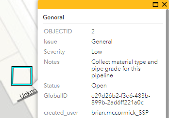
Next, I’ve launched the Gas Viewer web application that has my feature services as well as a few pre-configured widgets. There is a gas report widget and a measurement widget, but for this example, let’s focus on the ‘Map Notes Editor’ widget. Creating the map notes is straightforward and you’ll notice I’ve already created a couple of notes near my newly digitized services.
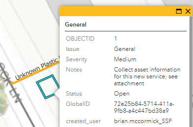
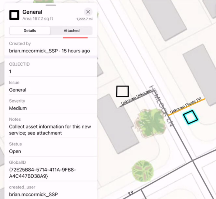
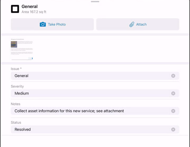
Users are able to configure the note type and designate the severity if it’s an issue or anomaly. For this example, I categorized the note as ‘General’ and added some notes for the field crew. Users also have the option of attaching files, and again for this example, I just used a screenshot I had hanging around on my laptop.
ArcGIS Field Maps – Field data collection
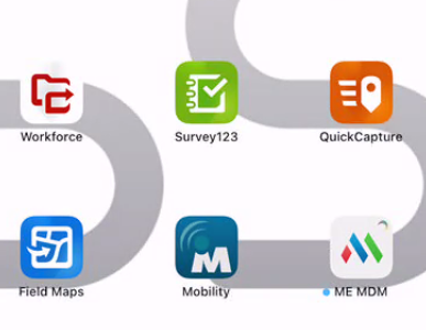
Next let’s jump to the field using the Field Maps mobile app to view the data that was just created and capture some additional details about the assets. I’ll launch Field Maps from my iPad home screen and launch the Gas Asset Collector map. Remember, this map comes out of the box with the solution, and the feature services are already configured within the map. Therefore, when I open the map it’s ready to go with Field Maps.
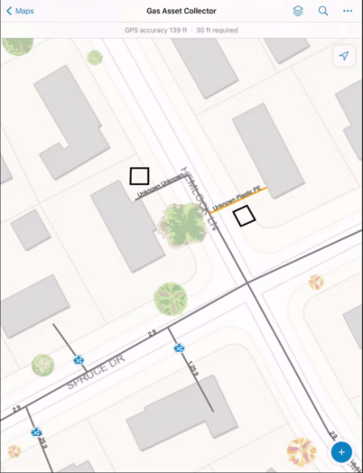
Upon launching the map, it zooms to the newly created services and map notes. Users can investigate the data from their mobile device.
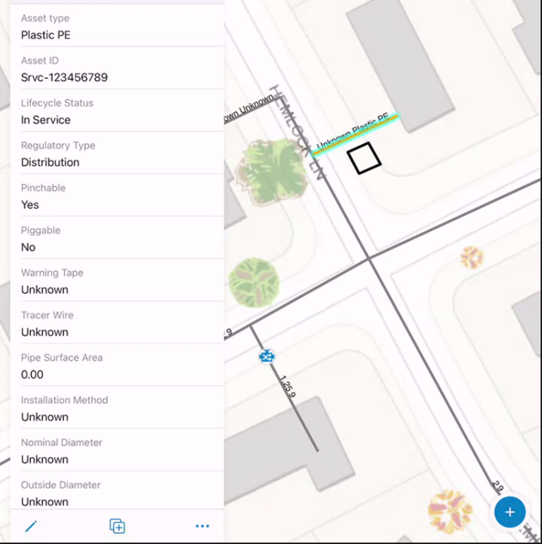
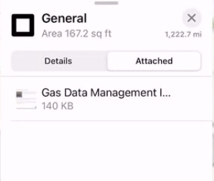
When a user clicks on the map notes they will see the notes that were created in the Gas Viewer Web App. Users will also notice there is a ‘details’ pane and an ‘attached’ pane. Recall that I attached a file when I created the map notes in the web app. Users can toggle between the panes and view or download attachments in the field.
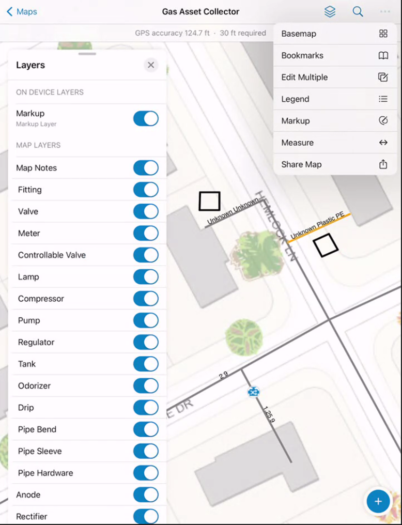
There are additional functionality options within Field Maps, such as turning on/off specific layers, changing basemaps, and other standard options that are inherent in the ESRI mobile products. I won’t go over those in detail here, but here is a screenshot just to illustrate some of those options.
Now let’s get to the actual work. I need to collect some information in the field. I’m going to start by collecting more information on my service lines. Notice that when I choose to edit the feature the default action is to edit geometry. In this case I don’t need to do that and will just be editing some attributes. I’ll be editing the installation method, nominal diameter, outside diameter, and in service date. Notice that the label for the service line updates upon applying the nominal diameter.
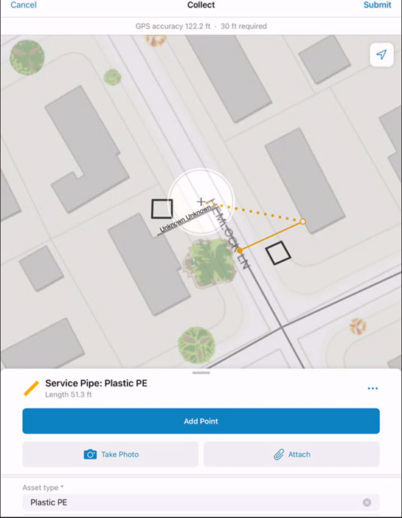
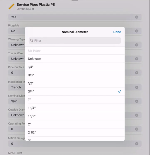
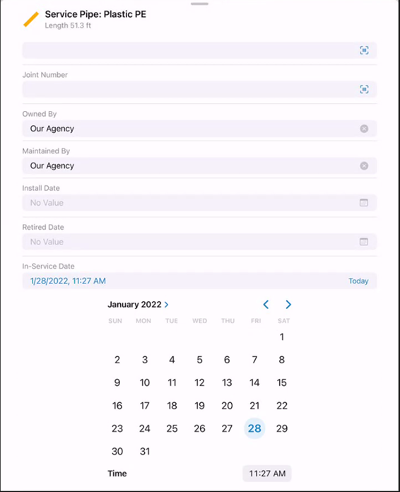
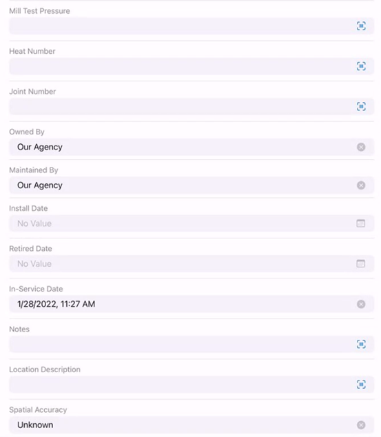
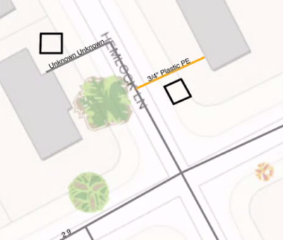
I also need to add a couple of excess flow valves since these were installed along with the service lines.
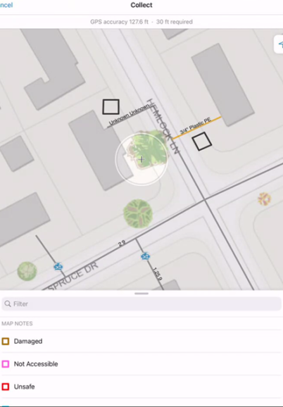
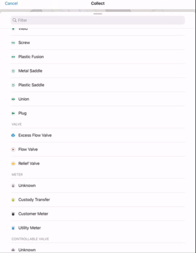
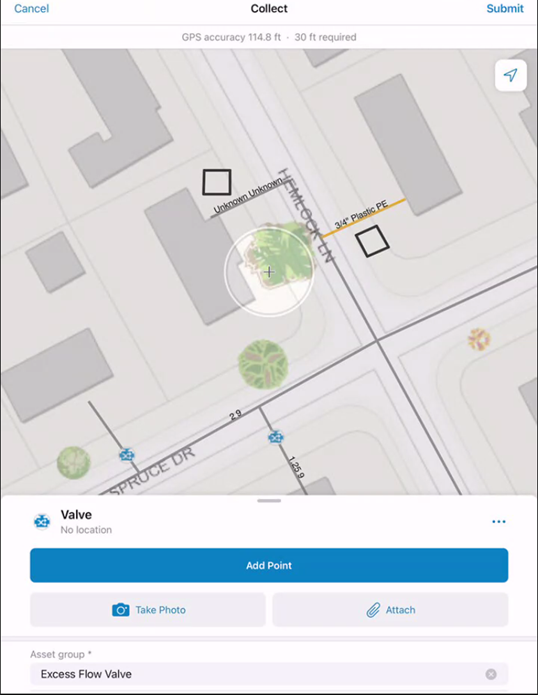
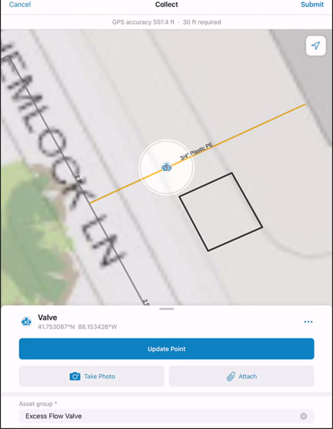
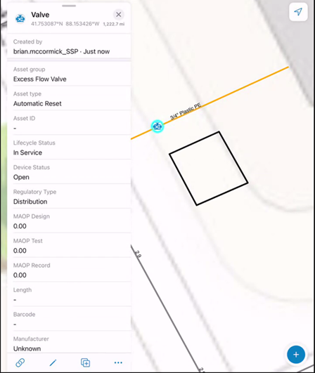
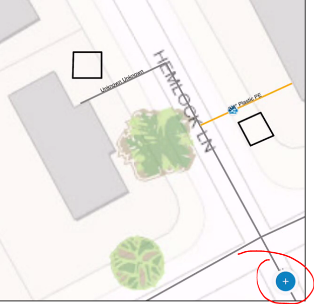
Notice that after I place the first EFV, Field Maps stores my ‘recent’ choices and places those at the top of the add data pane for quick and easy selection and placement. For the second EFV I’ll also take a photo of the installation and scan the barcode for the Asset ID. (Asset ID is one of several fields preconfigured for barcode scanning. In this example I took a photo of the gas meter at my house and scanned its barcode for the Asset ID).
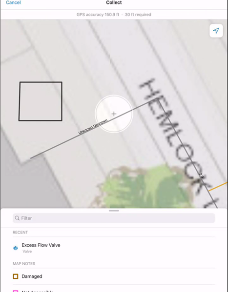
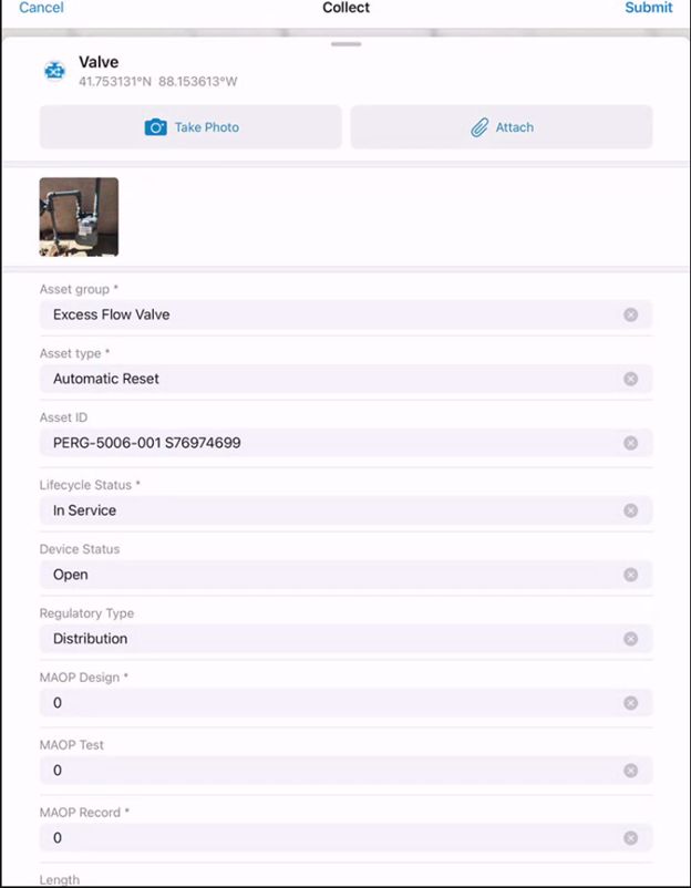
Once this is completed, I’ll edit the map notes to indicate that these items have been ‘resolved’ or closed. Notice that the map notes no longer appear on the map once the status is set to resolved.

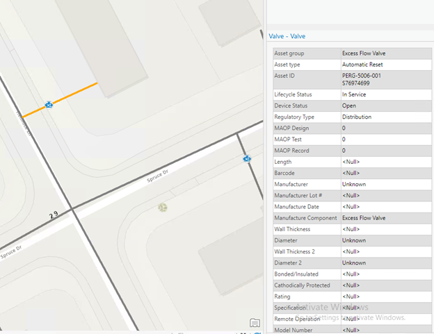
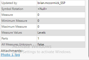
Finally, I’ll jump back over to ArcGIS Pro where I can see the data that was collected in the field pretty much instantly. I am also able to view the photo I took as an attachment from all three interfaces (desktop, web, mobile).
Why is it important?
The primary reason for taking the time to unpack the Gas Distribution Data Management solution is to demonstrate just how simple it can be to start working with your gas distribution data across the ArcGIS application suite. It also gives users the opportunity to start to visualize how their data may fit in with the Utility Network and UPDM. This is important if you’re a gas utility considering a move to the Utility Network and want to better understand the basics of the model, and how your GIS users can leverage the ArcGIS technology suite to work with the data more efficiently.
Of course, this solution barely scratches the surface of the Utility Network and its benefits, but this can be a good way to build a business case or demonstrate the collaborative nature of these tools within your organization.
Coming Soon
Keep an eye out for the third installment of this blog which will explore the Gas and Pipeline Referencing Utility Network Foundation and how that solution can be similarly beneficial in making the case to move your organization’s data to the Utility Network.
What do you think?