Ah, cartography – just when I thought I’d heard all the best words associated with you, another pops up to steal my attention away for another EA article. Whilst barreling through the highly interesting Esri Academy MOOC course on Cartography, excellent value for literally zero dollars, section 3 dug into how symbolization and colour can affect the story that you want to tell with your map.
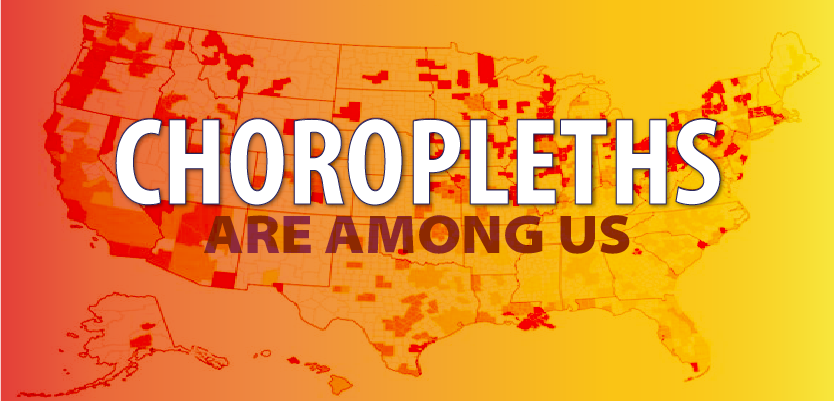
Having to know more, the internet was a beneficial donor of the needful – another Greek derivation (choros = area/region, plethos = multitude) – and at it’s most basic, it takes predetermined geographic separations/areas (like a state, country, voting district – something with agreed borders) and uses either a pattern or a color to proportionally show a statistical variable linked to that area – how many microbreweries per capita across the US. It’s probably the most popular type of data visualization in use today and odds are that the nearest copy of your magazine or newspaper has at least one in there. Of course, there’s already a map for that:

Historically, they’ve been around since the early 19th century, where Baron Pierre Charles Dupin, hardcore French mathematician type known best for the Dupin cyclide and the Dupin indicatrix (less saucy than they sound), banged one together to show the availability of basic education by department (governmental division by geography – national/administrative region/department/commune). These cartes teintées (colored maps) quickly caught on elsewhere, thanks to increasing availability of demographic data from national censuses, choropleths were used first in the 1841 Census report for Ireland, with color creeping in only 10 years later, when chromolithography allowed multi-colour printing using chemicals. The term choropleth map was coined in 1938 by American cartographer and geosopher JK Wright, with a late bid to call them “ratio maps” soundly ignored.

Popular as they may be, there are a number of situations where choropleths are not the best way to convey information – a lot of the articles I read during research were pointing out when you *shouldn’t* use a choropleth and in why some maps are rubbish generally (a topic for a later article). Chief amongst them are when the variable is not a ratio but a raw count or number – the variable needs to be normalized (the classic example is population density). If you don’t do this, the maps often just shows where people live.
The next pitfall is usually showing too big an area – you probably don’t need to know how many pubs/bars there are per capita in Texas as a whole, that doesn’t help me in picking where I’m going to buy my next house, but by metro area is a good start and shows that I need to start work on convincing my spouse that New Orleans would be a much better bet:

Finally, the use of classification and it’s link to color is vital to get right. Too many colours (4-5 is a good number) and the map gets visually cluttered, you need to be able to separate out the data into distinct and useful classes. If you decide to go unclassed (every value gets a unique colour from a colour ramp (eg dark blue to light blue)), as Waldo Tobler proposed in early 1970s, the brain (and often your monitor and your printer) starts to have a hard time differentiating between very close shades in different parts of the map.
As with many areas of life, the more you leave out, the clearer it becomes – cartographers often use classes to filter out randon noise and insignificant variations and focus on meaningful information. An excellent example (and impressively interactive) is the Guardian’s analysis of the EU Leave referendum:

4 colours only, showing the strong (>15%) and weak preference to Leave or not in each UK voting constituency and tells a clear story. There’s a number of different ways more supporting data could be added, but that leads into the world of bivariate choropleths – to paraphrase Joshua Steven’s great line, I’m not bivariate yet, but I am curious. Thanks for listening, if there’s anything more you’d like to know, get in touch.
Further reading:
Esri Academy MOOC course on Cartography – genuinely one of the best online courses I’ve taken, informative, educational and interesting, with lots of things to interest anyone with even a passing fancy for map.
ArcGIS Story Map on Choropleth Maps
Obligatory XKCD comic – heatmaps
https://datavizcatalogue.com/methods/choropleth.html – good overview of tools available to create choropleths.

What do you think?