A while back, a client of ours presented an innovative idea that would allow them to identify important map data on the fly. Now, most users of ArcGIS are familiar with layer symbology and how useful it can be. However, adding and configuring layer symbology takes plenty of time and effort.
As a software company, we look for every opportunity to automate and simplify these difficult tasks. Also, we thought it was a cool idea!
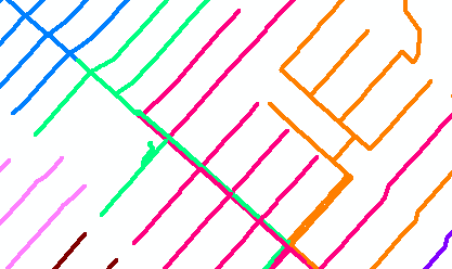
The idea was simple: take a signature field that is common to many features on our map – let’s say, Feeder ID – and base the symbology around it. Colors would be used to give the quickest visual representation of the system.
In our implementation, a unique color is assigned to each Feeder ID. We then categorize the symbology for each network feature with this set of feeder colors. Wrapping all of this work into an ArcMap command allows a user to toggle on this unique symbology with the click of a button.
The result may look like a pack of Skittles, but it provides a useful visual of where each conductor is fed from.

Another requirement of the tool presented an interesting challenge. Feeders that are adjacent to one another in the network (like those that meet at switches) need to have distinctly different colors. To ensure this, we developed a graph-coloring algorithm that intelligently selects an inverse color for an adjacent feeder.
Then, we traverse the network recursively to generate a color mapping that is free from confusion.
What’s the best part about all of this, you ask? Well, we’re excited to inform you that this tool has been built, and is almost ready for packaging and shipping. That is, in the form of an ArcMap Add-in.
This new technology from Esri allows us to distribute the tool to anyone who would like to try it, without the added overhead of using installers.
Stay tuned for an update!


What do you think?