
Over the past several months we’ve been covering some interesting ways you can use ArcGIS Online to enable your existing utility operations including pole inspections, outage maps, and publishing your utility-related data to the public. We’ll keep writing about cool operational uses of ArcGIS Online in future months, but for this month’s article I wanted to switch gears to an equally powerful use in utilities – creating killer interactive reports for planning and projections (without any GIS expertise).
This could apply to almost any analytics you might track in your utility – planned expansion, targeted infrastructure replacement programs, cyclical inspections and maintenance, and many more. All of the above reports could be accomplished with just an Excel spreadsheet but we all know that putting data on a map provides tremendous value and a level of intuitiveness not possible in a spreadsheet.
In my example today I’m going to return to one of my favorite asset management themes – predictive failure analysis. Here we focus on proactively upgrading our network before the failures occur by analyzing past trends.
This all starts with some level of an asset management system that captures the reason why a specific asset failed. We just received a request from upper management asking for a report on why our transformers are failing in the field so they can target their inspection, replacement, and/or reinforcement program for next year. They would like the report constrained to the last five years of asset data.
Regardless of the specific asset management system you use, you should be able to pull this data out into a spreadsheet showing the statistics on why the assets have been failing. It might look something like this:
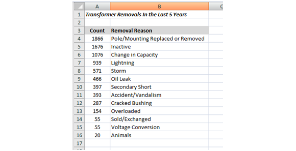
Based on this report, management comes back and says there’s not much they can do about the first three categories: Pole/Mounting Replaced or Removed, Inactive, or Change in Capacity, but they would like to know where the lighting and storm removals have occurred to see if there are any environmental/spatial patterns. Any patterns might change the utility’s plan of attack for reinforcing the network for better lightning or storm protection in those areas.
Here is where you have a choice to make:
- You could just add some installation zip code info to the report and ship it back. Easy, but not all that intuitive or useful.
- You could call the GIS department, provide them the info and ask them to print/pdf you a map using ArcMap. Much more valuable, but your GIS department might take a week or so to get you the results, which may or may not be acceptable.
- OR, you could use ArcGIS Online to create your own online interactive map without involving your GIS department at all!
Obviously we are going to opt for the third option. Our utility just purchased an ArcGIS Online subscription and gave me a login… I’ve been dying to try it out. How hard could it be? Let’s take a look…
-
- I head back to my asset management system and pull the raw data for the lightning and storm removals including the addresses of the assets which most asset management systems track in their location data. The key is to combine the street address data into a single field which will make it VERY easy to use in ArcGIS Online. I end up with removal information and addresses in a spreadsheet:
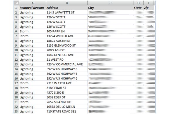
- I save the above Excel file as a CSV (comma separated value) to my local computer.
- I log into my ArcGIS Online account at http://www.arcgis.com and click the “Map” button to create a new Web Map.
- Then I just drag and drop (this is my favorite part) the CSV file from my local computer folder onto the web browser and it will then prompt me to confirm the address fields which it has auto-assigned based on the column names in the CSV:
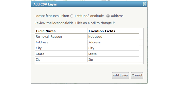
- Clicking Add Layer will add the data to my web map.
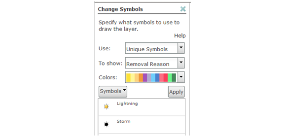
- I then can modify the default symbology to show the lightning removals with different symbols than the storm removals directly within the web map:
- I head back to my asset management system and pull the raw data for the lightning and storm removals including the addresses of the assets which most asset management systems track in their location data. The key is to combine the street address data into a single field which will make it VERY easy to use in ArcGIS Online. I end up with removal information and addresses in a spreadsheet:
And with those few steps I now have an interactive web map showing the lightning and storm transformer removals across my service territory.
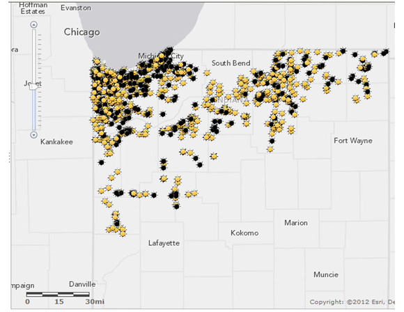
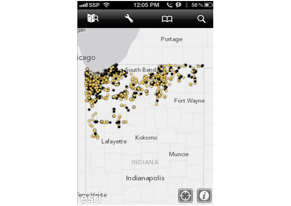
I can now publish this web map to the other users within my organization including upper management and they can use the map for their own presentations, recommendations, etc. They can access this map on any device – PC, iPad, Android, iPhone, etc:
Based on this information they would obviously want to concentrate their lightning/storm reinforcement plans in the northwest of the service territory. And the cool part is that they can zoom in to that area to get as much detail as they want.
In the end we’ve provided them much more than a report – we’ve provided them an interactive web application that is easy, intuitive, and provides much more value than an Excel spreadsheet. And not to harp too much on the point, but the asset management group generated this map themselves without calling the GIS department… all in just a few minutes time, which was mostly spent getting the data out of the asset management system.
And therein lies one of the major benefits of ArcGIS Online. We can enable the entire organization with the power of GIS without any GIS training or special expertise. Costs go down while value skyrockets!

What do you think?