Symbology is often simply thought of as the graphic representations a map uses to indicate real-world objects. Typically, this means symbolizing objects based on shared attributes. However, an often-overlooked use of symbology is as a means to identify data discrepancies and detect errors by highlighting features that are different instead.
SSP has extensive experience in working with and symbolizing various types of data. Some of our projects symbolize point data, like that collected by GPS, in a manner that makes it easier for GIS Specialists to do the following:
- spot data discrepancies, such as inconsistencies in pipe diameter;
- Identify required pipe fittings that were not GPS’d;
- Analyze main depth of cover for accuracy;
- Identify missing main pressure test points.
Additionally, requests for further data review or the capture of missing GPS data are sent to individuals who may not have formal GIS training. In situations like this, including unique symbology with the traditional text description can make it easier to convey to the recipient what these discrepancies are, where they are located, and what need to be done to correct them.
First, symbology can be used to identify attribute errors. In this example, GPS data has been collected along a newly installed gas main (Figure 1). The circles represent main pipe points and the triangles represent reducer fittings, which join pipes of different diameters.

It is common to have situations where active gas mains are all symbolozied using the same color, even with different pipe diameters and materials. If a new symbology level using pipe attributes has been applied, it becomes easier to identify discrepancies in the GPS point attributes. For example, Point A is incorrectly attributed as a 2” PE (plastic main) pipe, as it comes before a 2” x 4” reducer that joins a 4” PE main segment to the 2” PE main segment. Similarly, Point B also needs to have its attribution changed, as this point is currently displayed as 4” PE pipe which is incorrectly appearing after a 3” x 4” reducer.

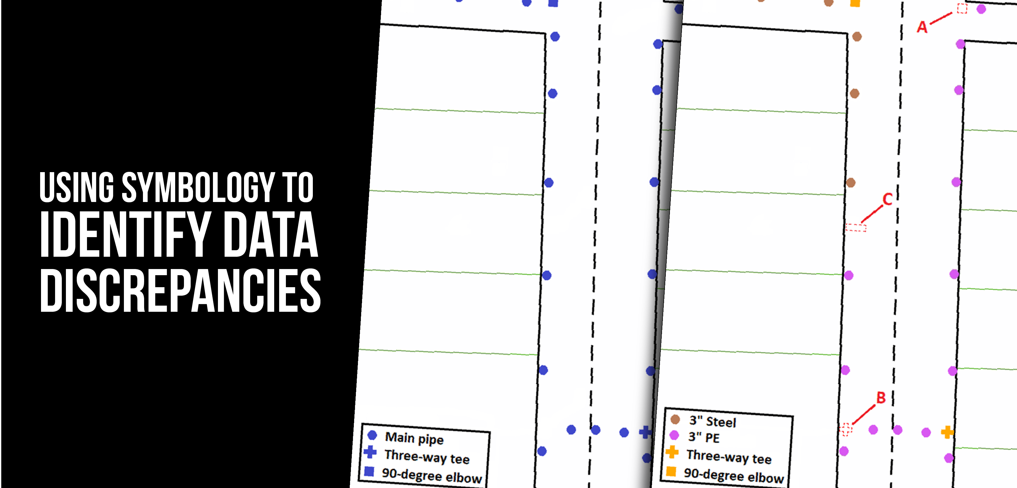
Secondly, symbolization can be used to identify missing GPS data. For this example, symbolization is utilized to highlight where GPS data about gas fittings should have been collected (Figure 2). In the pictures below, the circles represent main pipe points, the plus signs represent three-way tees, and the squares represent 90-degree elbows.

Here, the symbol color for both fittings and pipe attributes were changed to help make errors more apparent (Figures 3 and 4). At locations where a gas main makes a 90-degree bend, like at Point A, an elbow fitting is used to join two separate segments of pipe – this elbow fitting should have been captured with a GPS point. A three-way tee is used to join three separate segments of pipe, allowing for the continuous flow of gas. A missing three-way tee is indicated at Point B. Using a different color for fittings can make errors such as the one at Points A and B pop. Other errors, such as a missing transition fitting (that joins plastic main to steel main) at Point C, would not have been apparent without changing the symbol color.

Next, symbolization can be utilized to help determine where depth of cover symbols need to be placed or to check for anomalies in recorded main depth. Depth of cover symbols are used to represent when a segment of main has been installed in shallower or deeper than normal conditions due to various physical conditions present, such as road or river crossings.
In the following example, main points were symbolized based on the normal depth (green) or when placed at a shallower or deeper than normal location (red) (figure 5). The points highlighted at A display a scenario in which the main is installed deeper than normal due to the road crossing and will need depth of cover symbology placed on the map. However, Point B deviates slightly compared to surrounding GPS points, indicating that this data will need to be investigated further to determine if this deviation in elevation is accurate.

Finally, changing point symbology can be useful in making main pressure tests easier to decipher, as well as to determine if more test points need to be captured. Main segments are pressured tested to ensure the integrity of the pipe and fittings and to identify any possible weaknesses in the system in an effort to prevent a future failure once the pipeline is put in service. Especially for larger main installations, main segments are installed and pressure-tested in separate, distinct pressure tests. Pressure test points need to be captured at every bounding point for the segments covered by a distinct pressure test.
In the example below, a 2” PE segment was installed and tested under Pressure Test 1 (Figure 6). At a later date, a 3” PE segment was installed and tested under Pressure Test 2. When each pressure test is symbolized with different colors, it becomes apparent that a pressure test point needs to be captured at Point A, on the eastern end of the 3” PE main segment.


What do you think?